Introduction to SASS
SASS (Syntactically Awesome Stylesheets) is a powerful preprocessor scripting language that enhances CSS with advanced features. It’s compiled into standard CSS, making it a robust tool for modern web development.
Benefits Over Traditional CSS
Improved Code Organization
- Nesting Capabilities: SASS allows you to nest your CSS selectors in a way that follows the same visual hierarchy of your HTML.
- Modular Approach: You can split your CSS into multiple files (partials) and import them into a main file, making your project more organized.
Maintainability
- Use of Variables: Define colors, fonts, and other CSS values as variables for easy updates and consistency across the project.
- Mixins for Reusable Code: Create reusable pieces of code for things like buttons, forms, which can be included wherever needed.
- Extend/Inheritance: Share a set of CSS properties from one selector to another, reducing the amount of code you need to write and maintain.
Advanced Features
- Control Directives: Use if/else statements and for/each loops in your CSS, which are not possible in plain CSS.
- Built-in Functions: SASS offers functions for color manipulation, mathematics and more, enhancing the functionality of CSS.
- Compatibility: Automatically handles browser prefixing, ensuring that your styles work across different browsers without extra code.
SASS Basics
Preprocessing
- Compilation: Sass files are preprocessed to generate standard CSS files.
- Usage: Use the
sasscommand in the terminal to compile Sass files. For example,sass input.sass output.css. - Watching Files: The
--watchflag allows Sass to monitor files for changes and recompile automatically.
1
2
3
4
5
// Command to compile Sass
sass input.sass output.css

// Command to watch and compile Sass
sass --watch input.sass output.css
Modules
- Splitting Code: Sass allows splitting code into multiple files.
- @use Rule: Loads another Sass file as a module, enabling access to its variables, mixins, and functions.
- Namespace: Refer to module contents using a namespace based on the filename.
1
2
3
4
5
6
7
8
9

// In _base.sass
$primary-color: #333

// In styles.sass
@use 'base'
.inverse
  background-color: base.$primary-color
  color: white
Operators
- Math Operations: Sass supports standard math operators for calculations within CSS.
- Example: Calculating widths for a fluid grid using operations like division.
1
2
3
4
5
6
7
8

.container
  display: flex
article[role="main"]
  width: 600px / 960px * 100%
aside[role="complementary"]
  width: 300px / 960px * 100%
  margin-left: auto
SASS Role in Design:
In the design phase of any project, maintaining uniformity is extremely important for creating a polished look. SASS allows for this by allowing the use of variables to store and reuse colors, fonts, and other design elements.
This makes it so that there is a consistent theme applied throughout the entire project. SASS allows for visual cohesion.
Visual Concept as a Blueprint
Before going into the functional code, it is very important to create a visual concept or design mockup. This is a model for the project, which gives a clear visual representation for the final product. It allows for a scrum team to align on the aesthetics and overall design direction.
This also allows for feedback and iteration. People can make adjustments to the visual elements without complexity of functional code, and it makes sure that all requirements are met.
These visual concepts also play a role in planning the responsive design. The team members can visualize how layouts and styles are adapted for different screen sizes, so that all users can have a great visual experience across all types of devices.
Hacks
Explore SASS documentation to discover any additional features not covered in the lesson and implement one or more of these features in your GH Pages project. Write a couple sentences explaining the feature and demonstrate it.
- Keyframes (@keyframes): In SCSS, you can define a set of keyframes named rotate. These keyframes specify the rotation transformation from 0 degrees to 360 degrees.
Partials and Modular Styling with SASS
Understanding SASS Partials:
SASS partials are separate files containing any specific style or component. They allow for better organization and modularization of styles. They play a very important role in organizing and modularizing styles.
Partials are named with a leading underscore (e.g., _variables.sass) to indicate that they are meant to be imported into another stylesheet.
Benefits of Using Partials:
- Modular Organization:
- Partials break down stylesheets into smaller files, each focusing on a specific aspect (e.g., variables, typography, layout).
- This modular approach improves code organization, making it easier to maintain and scale.
- Code Reusability:
- Partials enable the reuse of styles across multiple files. For example, a
_variables.sasspartial may store color schemes and fonts, allowing for greater consistency.
- Partials enable the reuse of styles across multiple files. For example, a
- Readability and Collaboration:
- Smaller files enhance code readability. Developers can quickly locate and understand specific styles.
- Supports concurrent development, allowing different team members to work on different partials simultaneously.
Importing Partials into a Main SASS File:
To use SASS partials, import them into a main SCSS file using the @import directive. The main file (e.g., main.sass) serves as the entry point for compiling styles.
Importing Partials into a Main SASS File:
1
2
3
4
5
6
7
8
9
10
11
12
13
14
15

// main.sass

// Importing variables partial
@use variables

// Importing typography partial
@use typography

// Importing layout partial
@use layout

// Importing components partial
@use components
Variables in SASS
Introduction to Variables:
SASS variables provide a way to store information for later use in a stylesheet. They offer several advantages, including enhanced maintainability and consistency, by allowing you to define values in one location.
Variable Syntax:
In SASS, variables are declared using the ‘$’ symbol followed by the variable name. Once a variable is defined, its value can be reused throughout the stylesheet.
Variable Syntax:
1
2
3
4
5
6
7
8
9
10
11
12
13
14
// _variables.sass

// Define variables
$primary-color: #3498db
$secondary-color: #2ecc71

// Use variables
body
  background-color: $primary-color

.button
  background-color: $secondary-color
  color: #fff
SASS Variable Scope:
Variable scope is similar to the range in which a variable is accessible. By default, variables are local to the file in which they are defined. However, you can create a GLOBAL VARIABLE:
By default, variables are local to the scope in which they are defined. However, the !global flag can be used to create global variables. Global variables are accessible throughout the entire stylesheet.
Global Variables:
1
2
3
4
5
6
7
8
// _variables.sass

// Local variable
$local-font-size: 16px !default

// Global variable
$global-font-size: 18px !global
Variable Scope:
1
2
3
4
5
6
7
8
9
10
11
12
13
14
15

// styles.sass

// Importing variables partial
@use 'variables'

$font-size: 14px // Global variable

body
  font-size: $font-size // Accessing the global variable

.container
  $font-size: $local-font-size // Local variable within .container scope
  font-size: $global-font-size // Accessing the global variable
Nested techniques
Basic Nesting:
1
2
3
4
5
6
7
8
9
10
11
12
13
14
15
16
17

nav
  background-color: #333

  ul
    list-style: none
    padding: 0
    margin: 0

    li
      display: inline-block
      margin-right: 10px

      a
        text-decoration: none
        color: #fff
In this example, the CSS output will be:
1
2
3
4
5
6
7
8
9
10
11
12
13
14
15
16
17
18
19
20
21

nav {
  background-color: #333;
}

nav ul {
  list-style: none;
  padding: 0;
  margin: 0;
}

nav ul li {
  display: inline-block;
  margin-right: 10px;
}

nav ul li a {
  text-decoration: none;
  color: #fff;
}
Many CSS properties have the same prefix, like font-family, font-size and font-weight or text-align, text-transform and text-overflow.
With SASS you can write them as nested properties:
1
2
3
4
5
6
7
8
9
10
11

font:
  family: Helvetica, sans-serif
  size: 18px
  weight: bold

text:
  align: center
  transform: lowercase
  overflow: hidden
The SASS transpiler will convert the above to normal CSS:
1
2
3
4
5
6
7
8
9

font-family: Helvetica, sans-serif;
font-size: 18px;
font-weight: bold;

text-align: center;
text-transform: lowercase;
text-overflow: hidden;
Flexbox and Grid Integration
Flexbox and Grid are two powerful layout systems in CSS that allow for responsive design and complex layouts with less effort.
Flexbox
- Purpose: Designed for 1D -dimensional layouts (either rows or columns).
Grid
- Purpose: Designed for 2D -dimensional layouts ( rows and columns together).
Simplifying Responsive Layouts with SASS
SASS enhances the use of Flexbox and Grid by allowing more organized and maintainable stylesheets.
- Variables and Mixins: Use SASS variables and mixins to create reusable Flexbox and Grid styles.
- Nesting: Nest media queries within selectors for responsive design.
- Functions: Use SASS functions to calculate flexible dimensions and spacings.
Advanced Mixins for Flexbox and Grid
Create advanced mixins for Flexbox and Grid for greater flexibility and customization. For example, a Flexbox mixin that allows you to specify direction, alignment, and wrap properties:
1
2
3
4
5
6
@mixin flexbox-container($direction: row, $justify: center, $align: center, $wrap: nowrap)
  display: flex
  flex-direction: $direction
  justify-content: $justify
  align-items: $align
  flex-wrap: $wrap
For Grid, create a mixin to dynamically set grid areas:
1
2
@mixin grid-areas($areas)
  grid-template-areas: $areas
Dynamic Layouts with SASS Functions
Use SASS functions to dynamically calculate layout values. For example, a function to determine the number of grid columns based on the container width:
1
2
@function grid-columns($max-width, $column-width, $gap)
  @return floor(($max-width + $gap) / ($column-width + $gap))
Apply these functions in Flexbox and Grid settings for responsive designs:
1
2
3
.grid-container
  @media (max-width: 1200px)
    grid-template-columns: repeat(grid-columns(1200px, 250px, 10px), 1fr)
Nested Media Queries for Responsive Design
Nested media queries enhance the management of responsive layouts. Combine them with SASS variables for consistency:
1
2
3
4
5
$item-breakpoint: 600px

.item
  @media (max-width: $item-breakpoint)
    flex: 100%
Demonstration: Complex Flexbox Layout with SASS
1
2
3
4
5
6
7
8
9
10
11
12
13
14
15
16
17
18
19
20
21
22
23
24
25

// Define variables
$primary-color: #333
$secondary-color: #777
$padding: 10px

// Mixin for flex container
@mixin flex-container
  display: flex
  justify-content: space-between
  padding: $padding

// Main container
.main-container
  @include flex-container
  background-color: $primary-color

  // Nested items
  .item
    flex: 1
    margin: 5px
    background-color: $secondary-color
    &:hover
      background-color: darken($secondary-color, 10%)
Demonstration: Responsive Grid Layout with SASS
1
2
3
4
5
6
7
8
9
10
11
12
13
14
15
16
17
18
19

// Grid container
.grid-container
  display: grid
  grid-template-columns: repeat(3, 1fr)
  gap: 10px

  // Responsive adjustment
  @media (max-width: 600px)
    grid-template-columns: repeat(2, 1fr)

  // Grid items
  .grid-item
    background-color: $primary-color
    padding: $padding
    &:hover
      background-color: lighten($primary-color, 10%)
Hacks
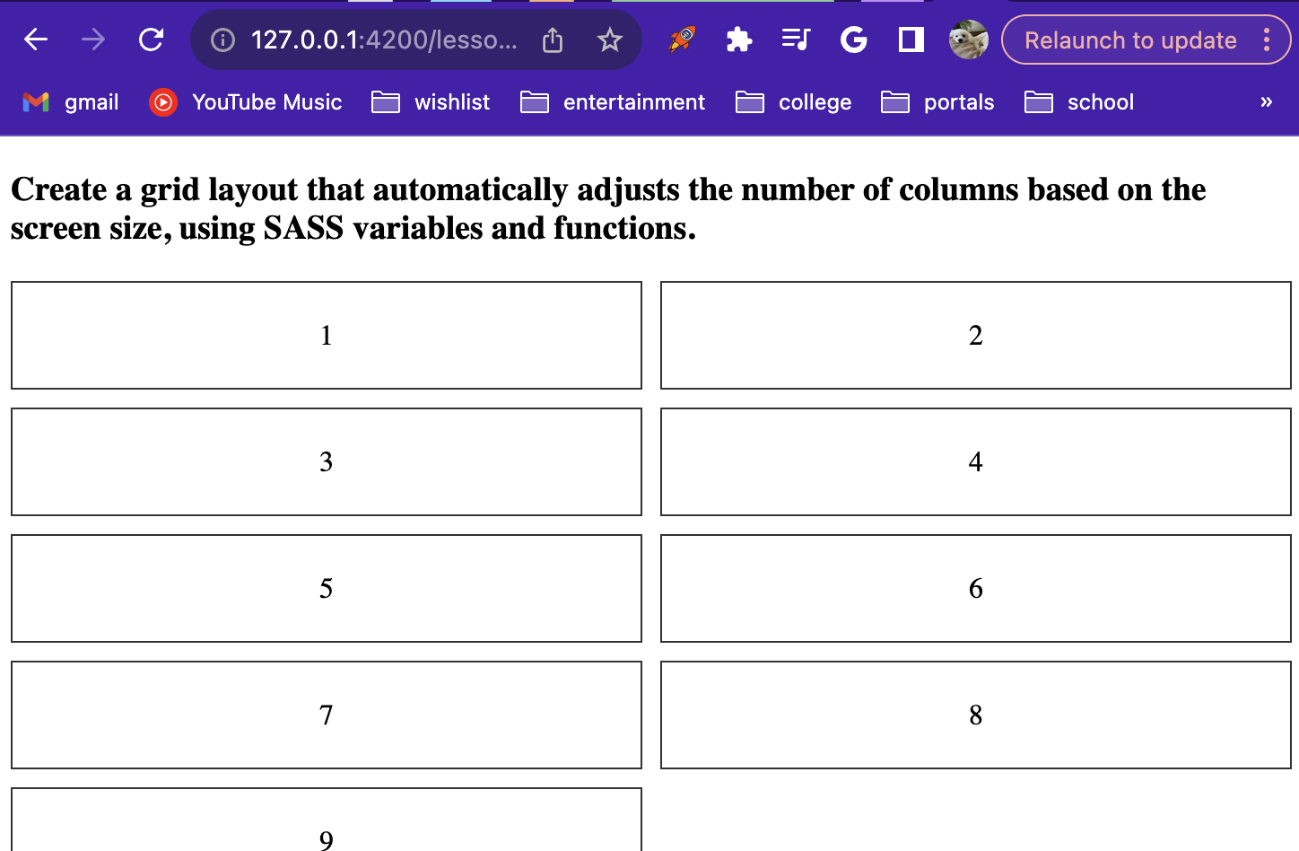
Create a grid layout that automatically adjusts the number of columns based on the screen size, using SASS variables and functions.
1
2
3
4
5
6
7
8
9
10
11
12
13
14
15
16
17
18
19
20
21
22
23
24
25
26
27
28
29
30
31
32
33
34
35
36
37
38
39
40
41
42
43
/*css*/
.grid-item {
    border: 1px solid #333;
    padding: 20px;
    text-align: center;
}

$small-screen: 576px;
$medium-screen: 768px;
$large-screen: 992px;
$x-large-screen: 1200px;

$max-columns: 5;

@function calculate-column-width($columns) {
  @return percentage($columns / $max-columns);
}

.grid-container {
  display: grid;
  gap: 10px;

  // Define grid-template-columns based on screen width
  @media (max-width: $small-screen) {
    grid-template-columns: repeat(1, 1fr);
  }

  @media (min-width: $small-screen) and (max-width: $medium-screen) {
    grid-template-columns: repeat(2, 1fr);
  }

  @media (min-width: $medium-screen) and (max-width: $large-screen) {
    grid-template-columns: repeat(3, 1fr);
  }

  @media (min-width: $large-screen) and (max-width: $x-large-screen) {
    grid-template-columns: repeat(4, 1fr);
  }

  @media (min-width: $x-large-screen) {
    grid-template-columns: repeat(5, 1fr);
  }
}
1
2
3
4
5
6
7
8
9
10
11
12
13
14
15
16
17
18
<html>
<body>
  <div>
    <h3>Create a grid layout that automatically adjusts the number of columns based on the screen size, using SASS variables and functions.</h3>
  </div>
  <div class="grid-container">
    <div class="grid-item">1</div>
    <div class="grid-item">2</div>
    <div class="grid-item">3</div>
    <div class="grid-item">4</div>
    <div class="grid-item">5</div>
    <div class="grid-item">6</div>
    <div class="grid-item">7</div>
    <div class="grid-item">8</div>
    <div class="grid-item">9</div>
  </div>
</body>
</html>
Scripting in SASS
SASS Scripting
Sass scripting involves using programming-like constructs (for loops, conditionals) in style sheets. It is extremely helpful in creating styles and gives you a lot of freedom difficult to achieve otherwise. Allows for more difficult and advanced styling compared to traditional CSS.
For Loops
Using for loops in styling drastically makes life easier while working with repetitive styles seeing as it enables generation of styles based on conditions.
1
2
3
4
5
6
7
$grid-columns: 12;

@for $i from 1 through $grid-columns {
  .col-#{$i} {
    width: percentage($i / $grid-columns);
  }
}
Define grid-columns and dynamically sets the width of each column using a for loop. Much shorter than it would normally be if you didn’t use a for loop.
For Loop Practice
What would appear if you used the following style on the html file below.
HTML
1
2
3
4
5
6
7
8
9
10
11
12
13
14
15
16
17
18
<html lang="en">
<head>
  <meta charset="UTF-8">
  <meta name="viewport" content="width=device-width, initial-scale=1.0">
  <link rel="stylesheet" href="output2.css">
  <title>Boxes</title>
</head>
<body>
  <div class="container">
    <!-- Colored boxes with pre-generated styles -->
    <div class="box" style="background-color: #ffffff;"></div>
    <div class="box" style="background-color: #ffffff;"></div>
    <div class="box" style="background-color: #ffffff;"></div>
    <div class="box" style="background-color: #ffffff;"></div>
    <div class="box" style="background-color: #ffffff;"></div>
  </div>
</body>
</html>
SASS
1
2
3
4
5
6
7
8
9
10
11
12
13
14
15
16
17
$colors: #ff0000, #ff7f00, #ffff00, #00ff00, #0000ff;

@for $i from 1 through length($colors) {
  .box:nth-child(#{$i}) {
    background-color: nth($colors, $i);
  }
}

.container {
  display: flex;
}

.box {
  width: 50px;
  height: 50px;
  margin: 5px;
}
Conditionals
Conditional statements in SASS allow you to apply styles based on certain conditions. This enhances the flexibility and reusability of your stylesheets.
If Statements
The ‘@if’ statement allows you to conditionally apply a style based on a specified condition.
1
2
3
4
5
6
7
8
$theme: 'dark';

.alert {
  @if $theme == 'dark' {
    background-color: #333;
    color: #fff;
  }
}
Else Statements
The ‘@else’ statement provides an alternate style when the intial @if statement condition is not met.
1
2
3
4
5
6
7
8
9
10
11
$theme: 'dark';

.alert {
  @if $theme == 'dark' {
    background-color: #333;
    color: #fff;
  } @else {
    background-color: #fff;
    color: #333;
  }
}
Else If Statements
The ‘@else if’ statement is used to check a condition when the preceding @if or @else if condition is not met.
1
2
3
4
5
6
7
8
9
10
11
$temperature: 25;

.condition {
  @if $temperature > 30 {
    background-color: #ff0000; // Hot
  } @else if $temperature > 20 {
    background-color: #ffcc00; // Warm
  } @else {
    background-color: #66ccff; // Cool
  }
}
Ternary Statement
Ternary operators provide a concise way to express conditional statements in just one line.
1
2
3
4
5
$success: true;

.message {
  color: $success ? #00cc00 : #ff0000;
}
Conditional Examples
1
2
3
4
5
6
7
8
9
$isLoggedIn: true;

.nav {
  @if $isLoggedIn {
    background-color: #33cc33; // Green for logged-in users
  } @else {
    background-color: #cc3333; // Red for guests
  }
}
1
2
3
4
5
6
7
8
9
$screen-size: 800px;

.element {
  font-size: 16px;

  @if $screen-size >= 768px {
    font-size: 20px;
  }
}
Hacks
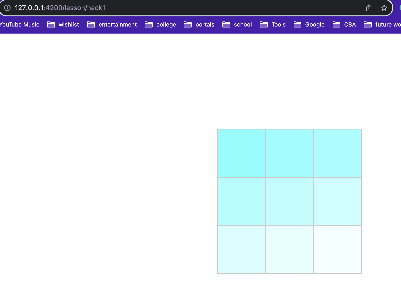
Define a custom SASS function that uses a for loop in order to slightly decrease the saturation and increase the brightness of a color of your choosing and fill in those increasingly more white colors into a 3x3 array of equal height and width.
Example Image
1
2
3
4
5
6
7
8
9
10
11
12
13
14
15
16
17
18
19
20
21
22
23
24
25
26
27
28
29
30
31
32
33
34
35
36
body {
  display: flex;
  justify-content: center;
  align-items: center;
  height: 100vh;
  margin: 0;
}

.grid-item {
  border: 1px solid #ccc;
  text-align: center;
  padding: 0px;
}

// function to decrease saturation and increase brightness
@function adjust-color($color, $saturation, $brightness) {
  @return desaturate($color, $saturation) + lighten($color, $brightness);
}

$base-color: #3498db;

// Create a 3x3 grid
.grid-container {
  display: grid;
  grid-template-columns: repeat(3, 100px);
  grid-template-rows: repeat(3, 100px);
  gap: 0px;

  // Fill in the grid with adjusted colors
  @for $i from 1 through 9 {
    .grid-item:nth-child(#{$i}) {
      background-color: adjust-color($base-color, $i * 2%, $i * 3%);

    }
  }
}
1
2
3
4
5
6
7
8
9
10
11
12
13
14
15
16
17
18
19
20
21
22
23
24
<!DOCTYPE html>
<html lang="en">
<head>
  <meta charset="UTF-8">
  <meta name="viewport" content="width=device-width, initial-scale=1.0">
  <title>3 by 3 Grid</title>
  <link rel="stylesheet" href="output.css">
</head>
<body>

<div class="grid-container">
  <div class="grid-item"></div>
  <div class="grid-item"></div>
  <div class="grid-item"></div>
  <div class="grid-item"></div>
  <div class="grid-item"></div>
  <div class="grid-item"></div>
  <div class="grid-item"></div>
  <div class="grid-item"></div>
  <div class="grid-item"></div>
</div>

</body>
</html>
Extending & Inheritance
Extending in SASS allows you to share styles between selectors, reducing redundancy. You have to use the @extend directive to do this. Inheritance in SASS involves using a placeholder selector, and they are represented with the percent sign %. These are essentially templates for styles. This allows for more abstraction and less repetition.
1
2
3
4
5
6
7
8
9
10
11
12
13
// common styles
%common-style
  color: #333
  font-size: 16px

// Use @extend to apply the common style to specific selectors
.button
  @extend %common-style
  background-color: #007bff

.link
  @extend %common-style
  text-decoration: underline
Handling Errors and Debugging in Sass
1. @error Directive:
The @error directive is used to raise an error and stop the Sass compilation process if a certain condition is not met. It’s helpful for catching issues early in the development process.
1
2
3
4
5
6
7
8
9
10
11
12
13
// SCSS Syntax
$primary-color: #3498db; // Change this to an invalid color, e.g., 'red'

@mixin validate-color($color) {
  @if type-of($color) != color {
    @error "Invalid color provided: #{$color}. Please provide a valid color.";
  }
}

.element {
  background-color: $primary-color;
  @include validate-color($primary-color);
}
1
2
3
4
%%html
<div style="background-color: #3498db; padding: 20px;">
  <p style="color: #fff;">This is an example element with a primary color background.</p>
</div>
This is an example element with a primary color background.
In this example, if the provided color is not valid, the Sass compilation will stop, and an error message will be displayed.
2. @debug Directive:
The @debug directive is used to print messages to the Sass output. It’s a handy tool for inspecting variable values, checking the flow of your code, and identifying issues during development.
1
2
3
4
5
6
7
8
9
10
11
12
13
14
15
// SCSS Syntax
$font-size-base: 16px; // Try changing this value to observe @debug output

@function calculate-line-height($font-size) {
  @debug "Calculating line height for font size: #{$font-size}px";

  $line-height-ratio: 1.5;
  $line-height: $font-size * $line-height-ratio;

  @return $line-height;
}
body {
  font-size: $font-size-base;
  line-height: calculate-line-height($font-size-base);
}
1
2
3
4
5
6
7
%%html
<style>
  body {
    font-size: 16px;
    line-height: 24px; /* Calculated line height */
  }
</style>
In this example, the @debug statement will print a message to the console during Sass compilation, providing information about the font size being used and assisting in identifying any potential issues.
Popcorn Hacks
Popcorn Hack 1:
Try changing the primary color to an invalid value (e.g., ‘red’) and observe the @error message. Then, correct it to a valid color. 
- changed it to a hex code for yellow right after
Popcorn Hack 2:
Modify the base font size and observe the @debug message. Try different font sizes and see how it affects the calculated line height. 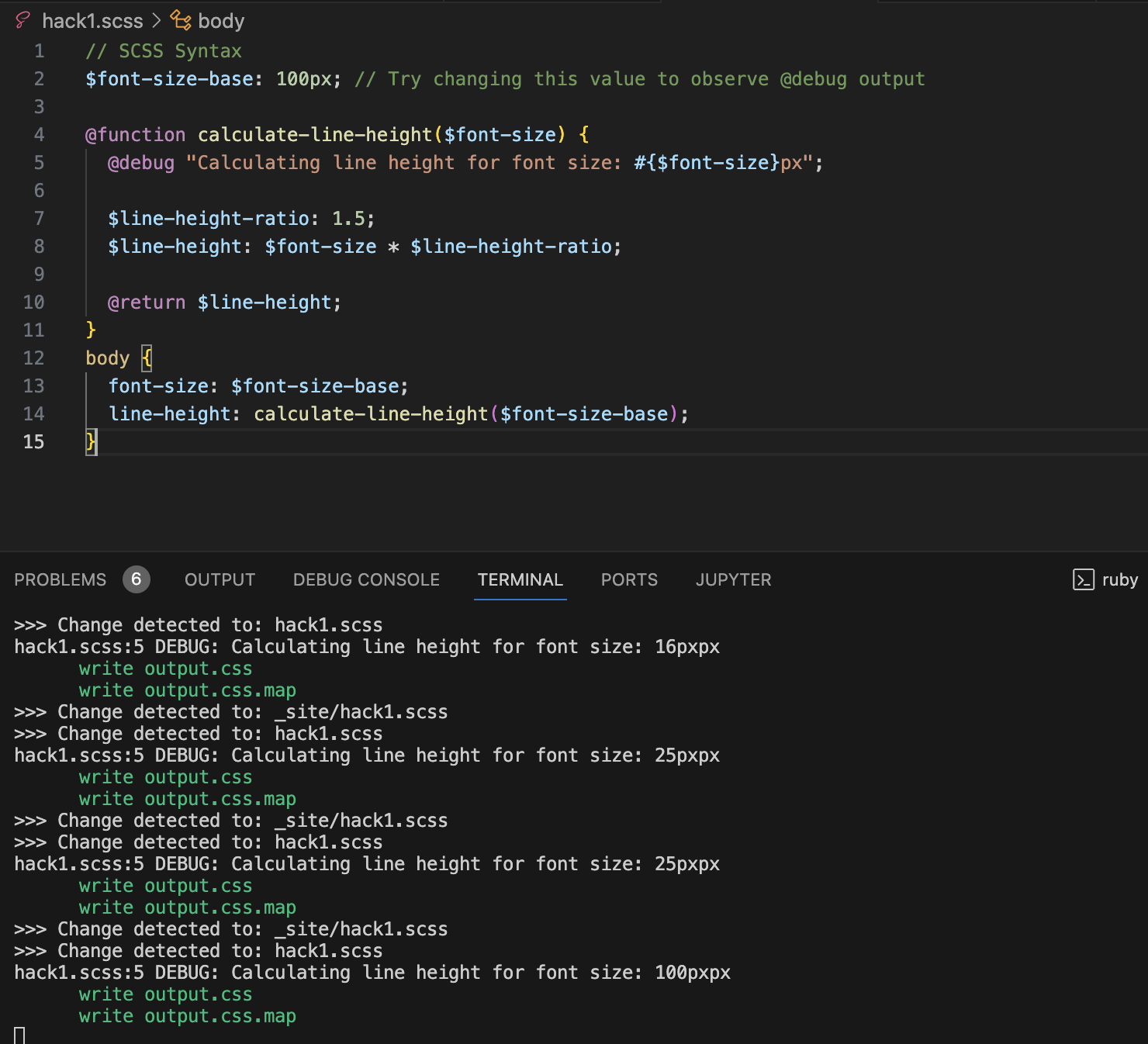
Hacks
Define a custom SASS function that uses a for loop in order to slightly decrease the saturation and increase the brightness of a color of your choosing and fill in those increasingly more white colors into a 3x3 array of equal height and width.
- this is the same hack as before. my code can be found above along with image proof
Example Image
Mixins
Mixins in SASS
- Mixins are reusable blocks of code.
- They help avoid repetition and keep code organized.
- Think of them like functions in programming that return CSS code.
```scss @mixin center-element { display: flex; align-items: center; justify-content: center; }
Mixin with Parameters
```scss @mixin box-shadow($x, $y, $blur, $color) { -webkit-box-shadow: $x $y $blur $color; -moz-box-shadow: $x $y $blur $color; box-shadow: $x $y $blur $color; }
Use of this mixin:
```scss .card { @include box-shadow(2px, 2px, 5px, rgba(0, 0, 0, .3)); }
Mixins for Responsive Web Design
Responsive Design
- It’s crucial for websites to work well on all devices.
- Responsive design adjusts the layout based on screen size.
Breakpoints in Responsive Design
- Breakpoints are screen sizes where the design changes.
- Common breakpoints are for mobile, tablet, and desktop screens.
Using Mixins for Breakpoints
- Mixins can encapsulate media queries for different breakpoints.
- This simplifies managing responsive styles.
Example of a Breakpoint Mixin
```scss @mixin for-mobile { @media (max-width: 600px) { @content; } }
Responsive Images and Media with SASS
Responsive Images and Media with SASS
Handling Images Responsively
- Images should adapt to different screen sizes.
- Techniques include scaling and changing sources for different resolutions.
Example: Scaling Images
```scss .responsive-image { width: 100%; height: auto; }
Device-Specific Media Queries
Targeting Specific Devices
- Media queries can be used to target styles for specific devices like iPhones or computers.
- This is based on characteristics like device width, height, and pixel ratio.
Example: Targeting iPhones
- Here’s how you might target styles specifically for iPhones: ```scss @media only screen and (min-device-width : 375px) and (max-device-width : 812px) and (-webkit-device-pixel-ratio : 3) { .iphone-specific-class { // iPhone-specific styles go here } }
This media query targets devices with specific dimensions and pixel ratios common to iPhones.
For targeting computer screens (like desktops), you might use a broader range: ```scss @media only screen and (min-width: 1024px) { .computer-specific-class { // Styles for larger screens like desktop computers } }
Conclusion
- SASS enhances CSS with features like mixins, leading to more efficient and maintainable code.
- Custom mixins for breakpoints greatly aid in creating flexible, responsive layouts.
- Techniques for responsive image and media handling in SASS ensure optimal visual presentation across different devices.
- Overall, SASS is a valuable asset in modern web development, streamlining the creation of responsive, visually appealing websites.

